Seahorse Nursery
Brand Identity, Website, Signage & Environmental Graphics
Seahorse Nursery Rebrand - a welcome change to the usual studio work and one we all enjoyed creating.
The directors of Seahorse Nursery in South London approached REAFE STUDIO looking for a refresh to their existing brand and physical location. We arranged to meet with the directors in person to determine the ethos and approach of the nursery and looked around the site to identify what was working or not working with the current branding. Then we presented our proposals.
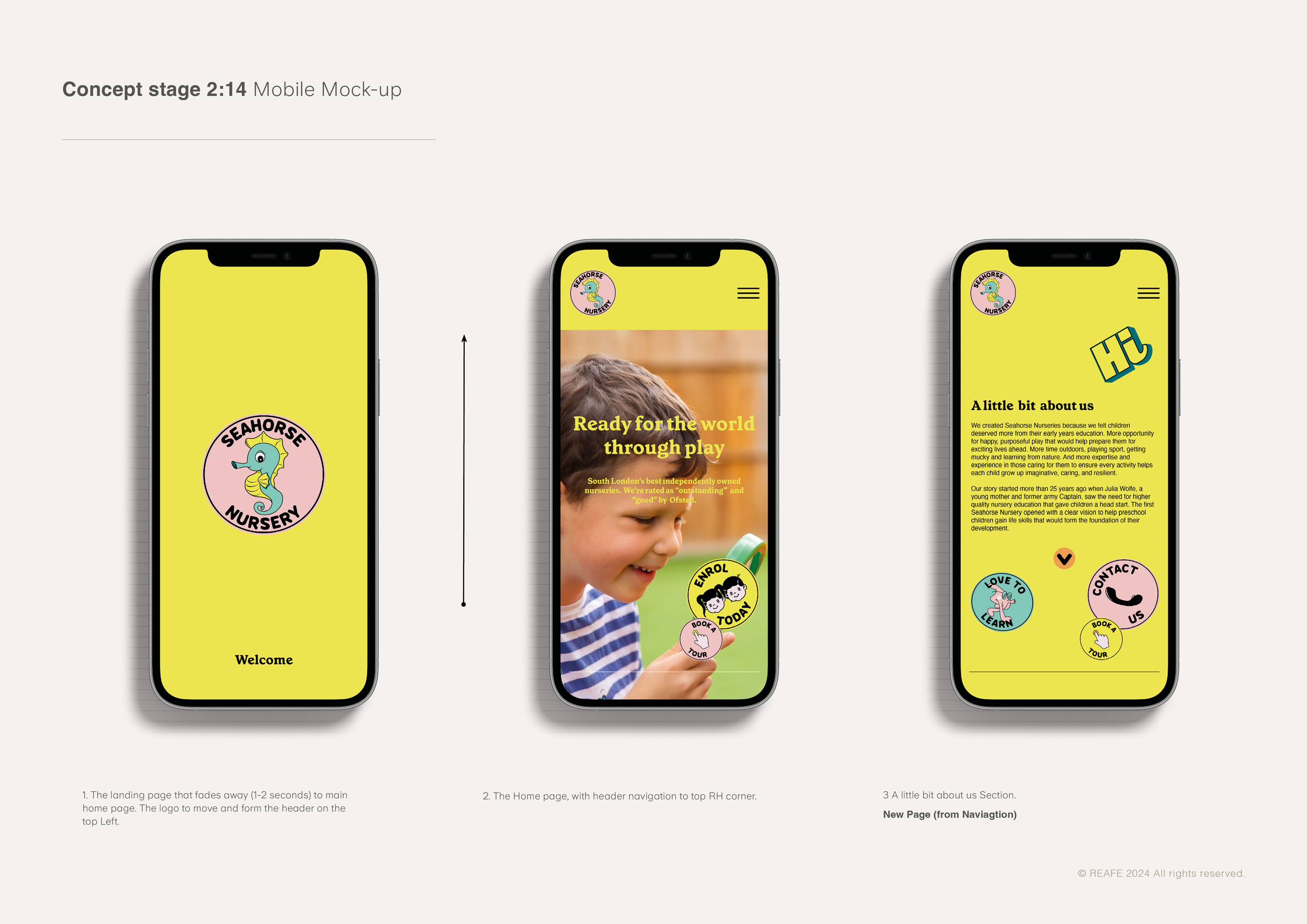
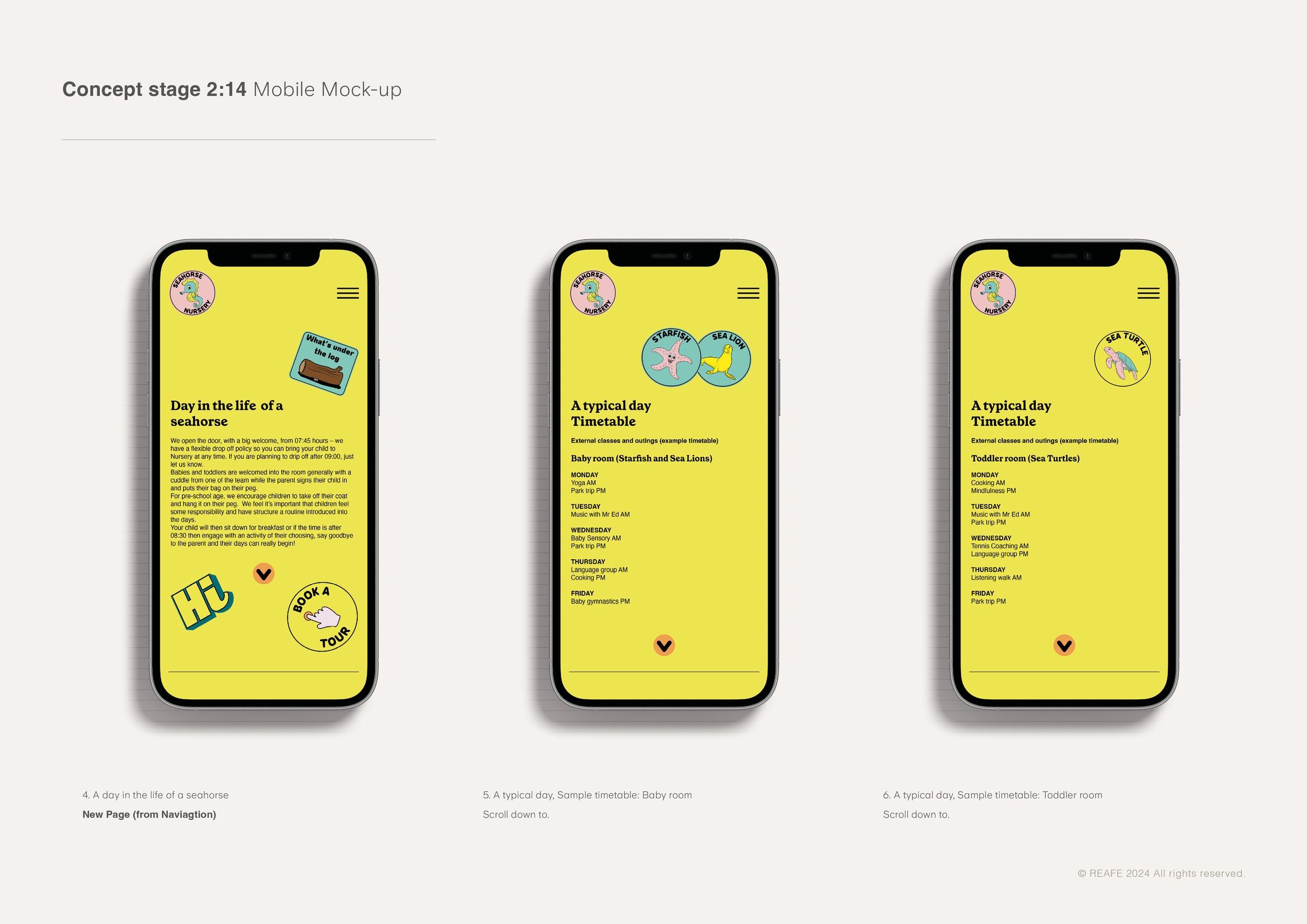
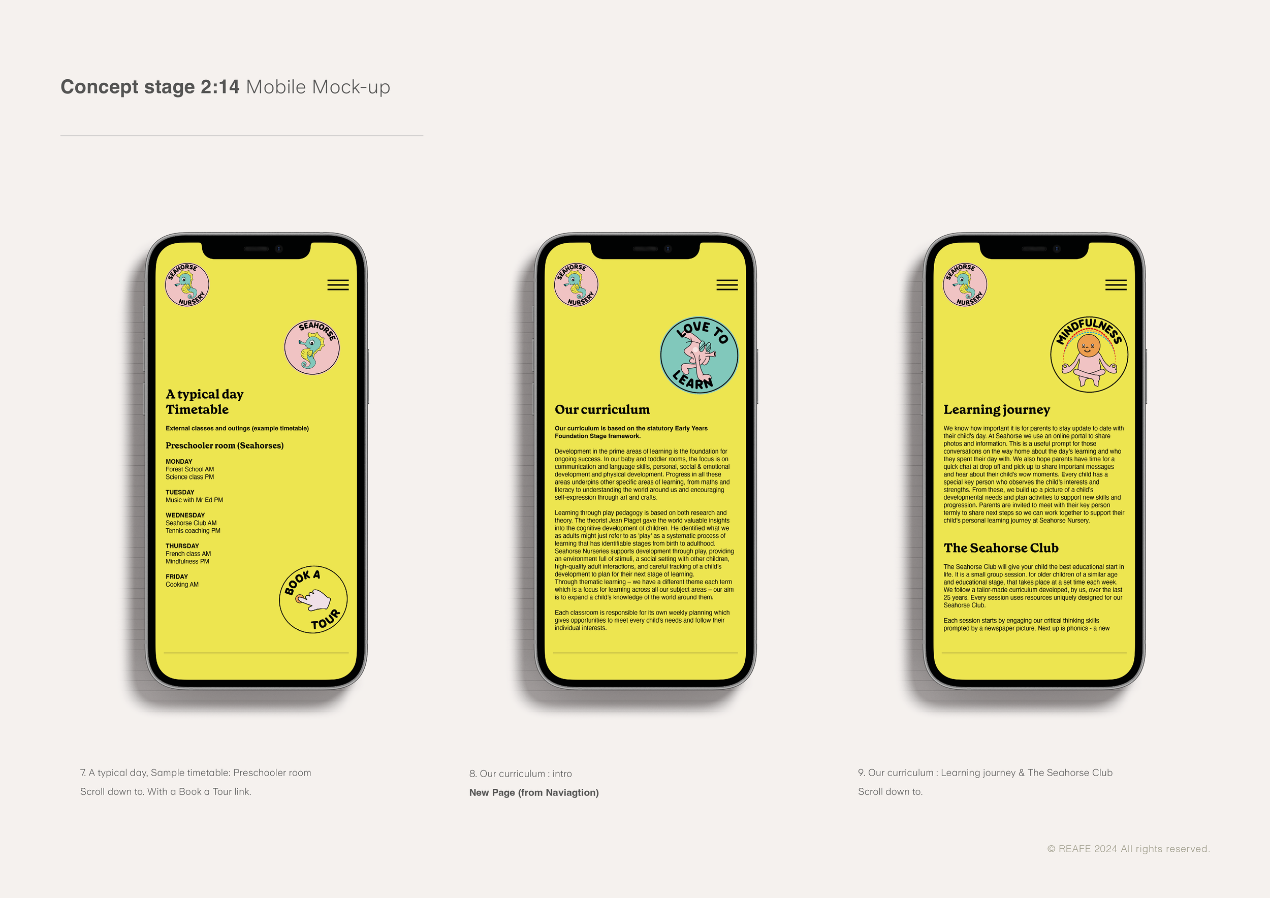
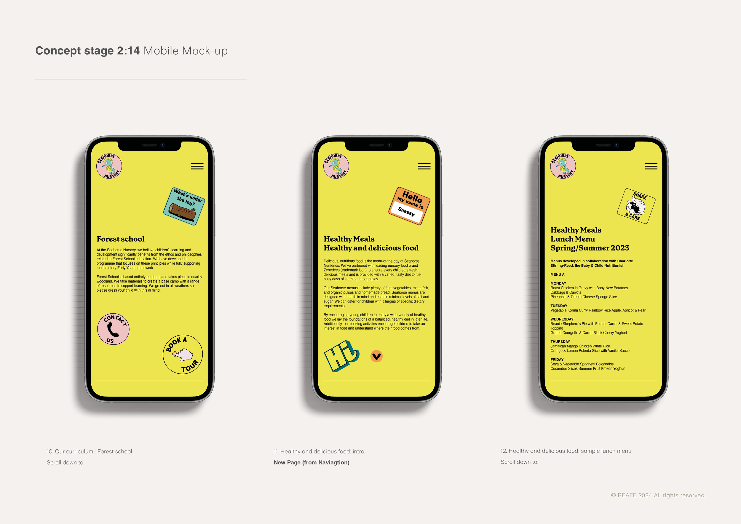
We have reimagined Seahorse Nursery as a space for learning and fun. We wanted to reflect the ethos of the directors: that Seahorse is more than a safe place for children to go while their parents work, but is instead committed to offering happy, purposeful play to stimulate children’s brains in this crucial period of early development. Seahorse Nursery believes in giving children far more time outdoors, playing sport, getting mucky and learning from nature. We also wanted to show the range of expertise and experience in the staff, and their commitment to ensure every activity helps each child to grow up creative, kind and resilient.
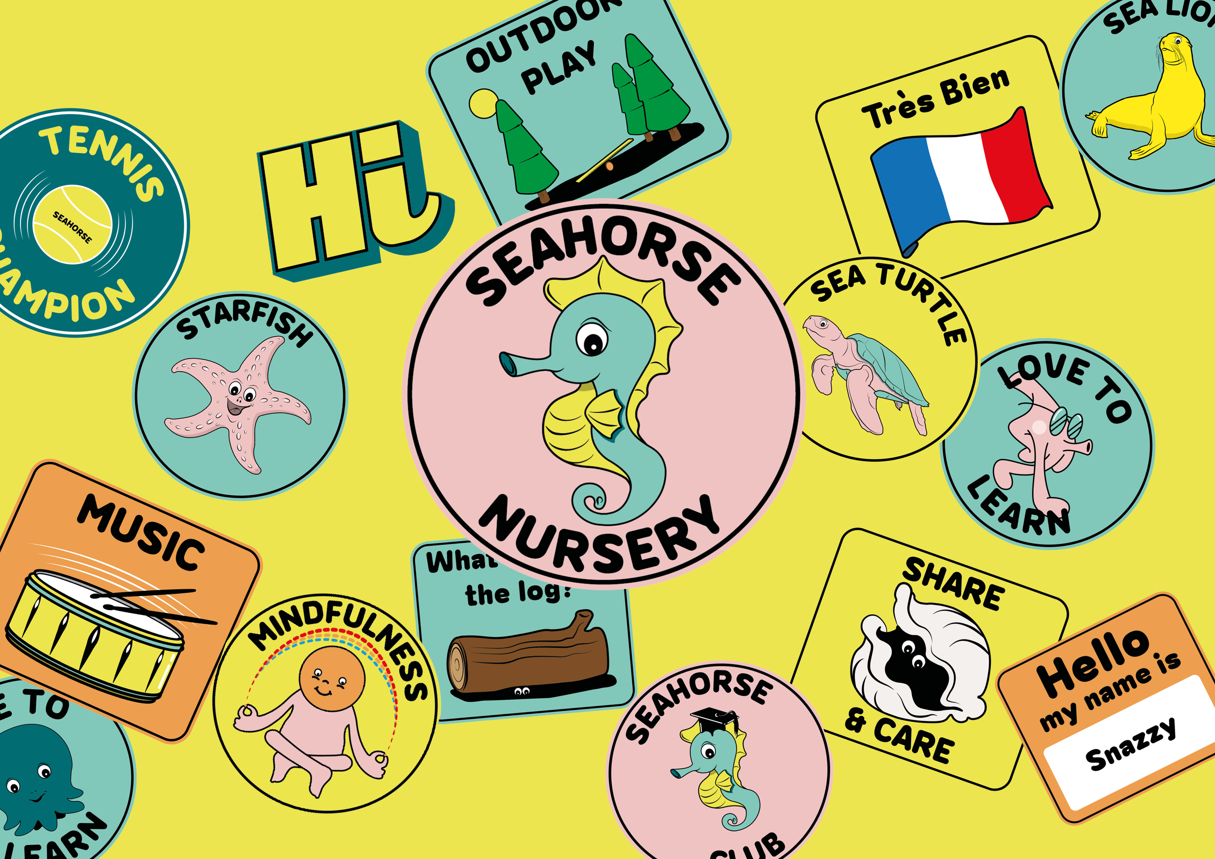
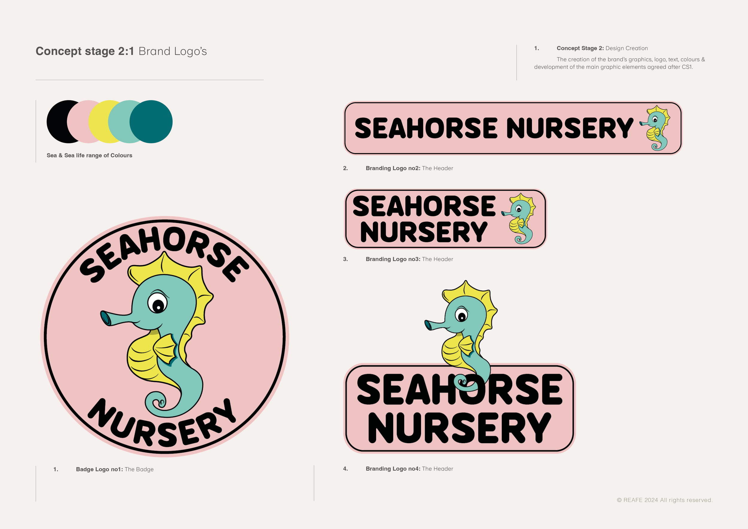
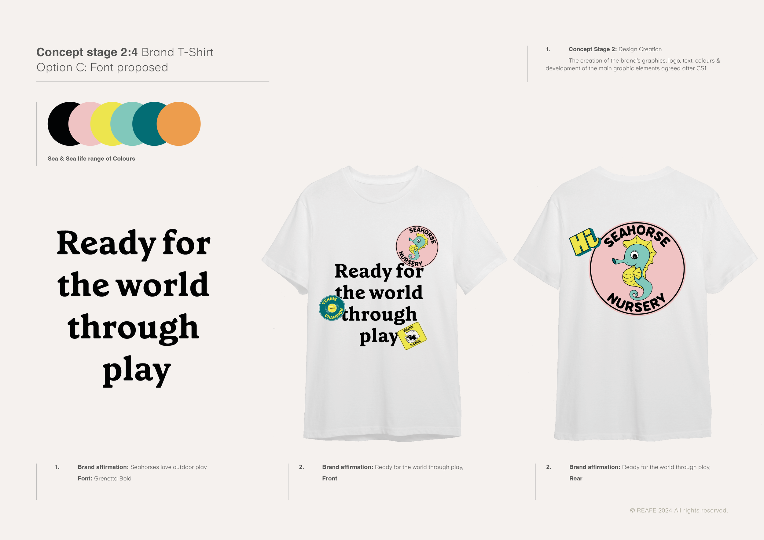
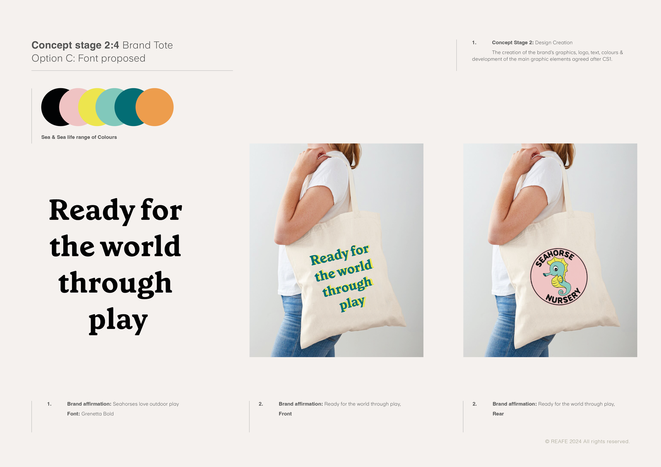
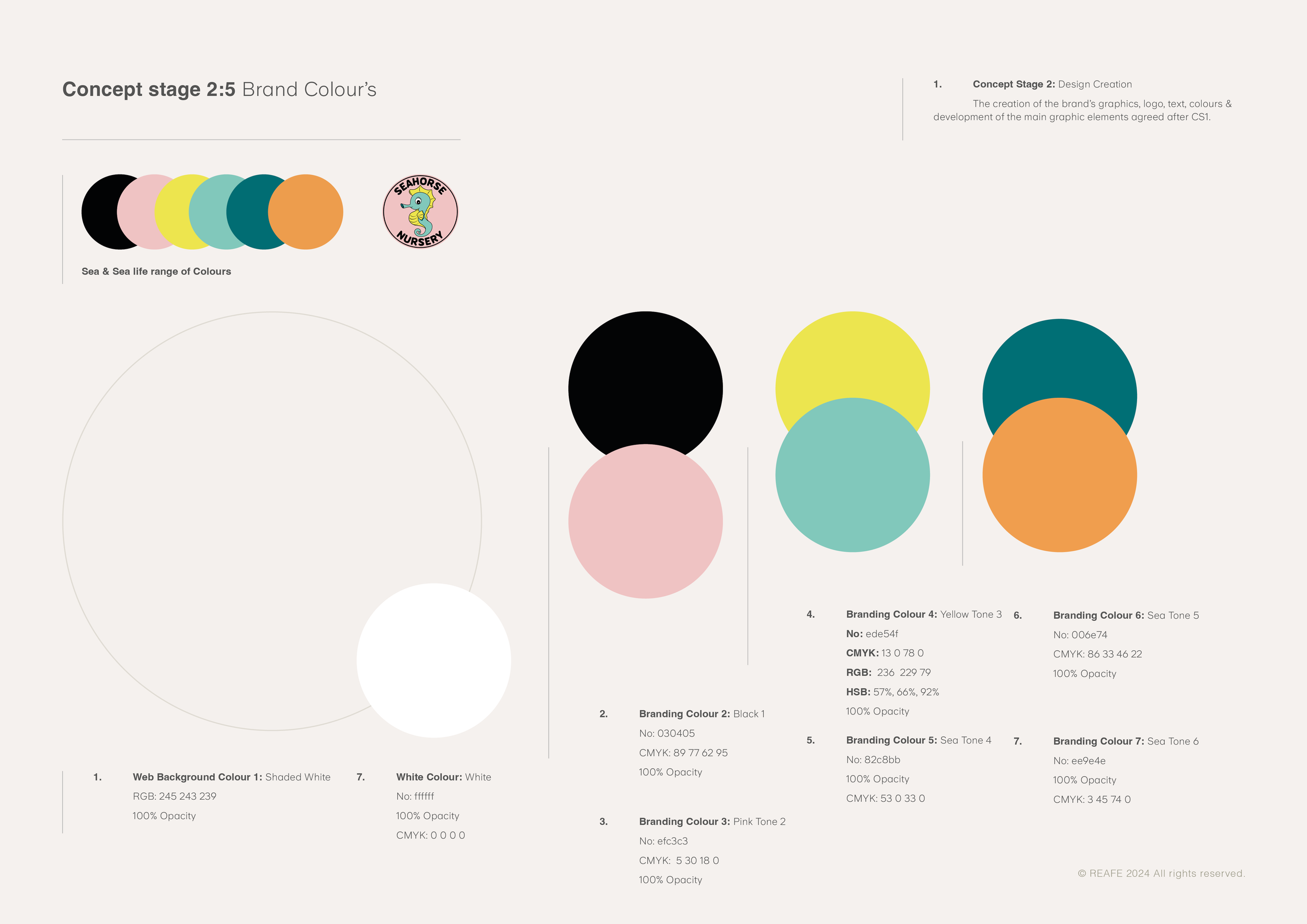
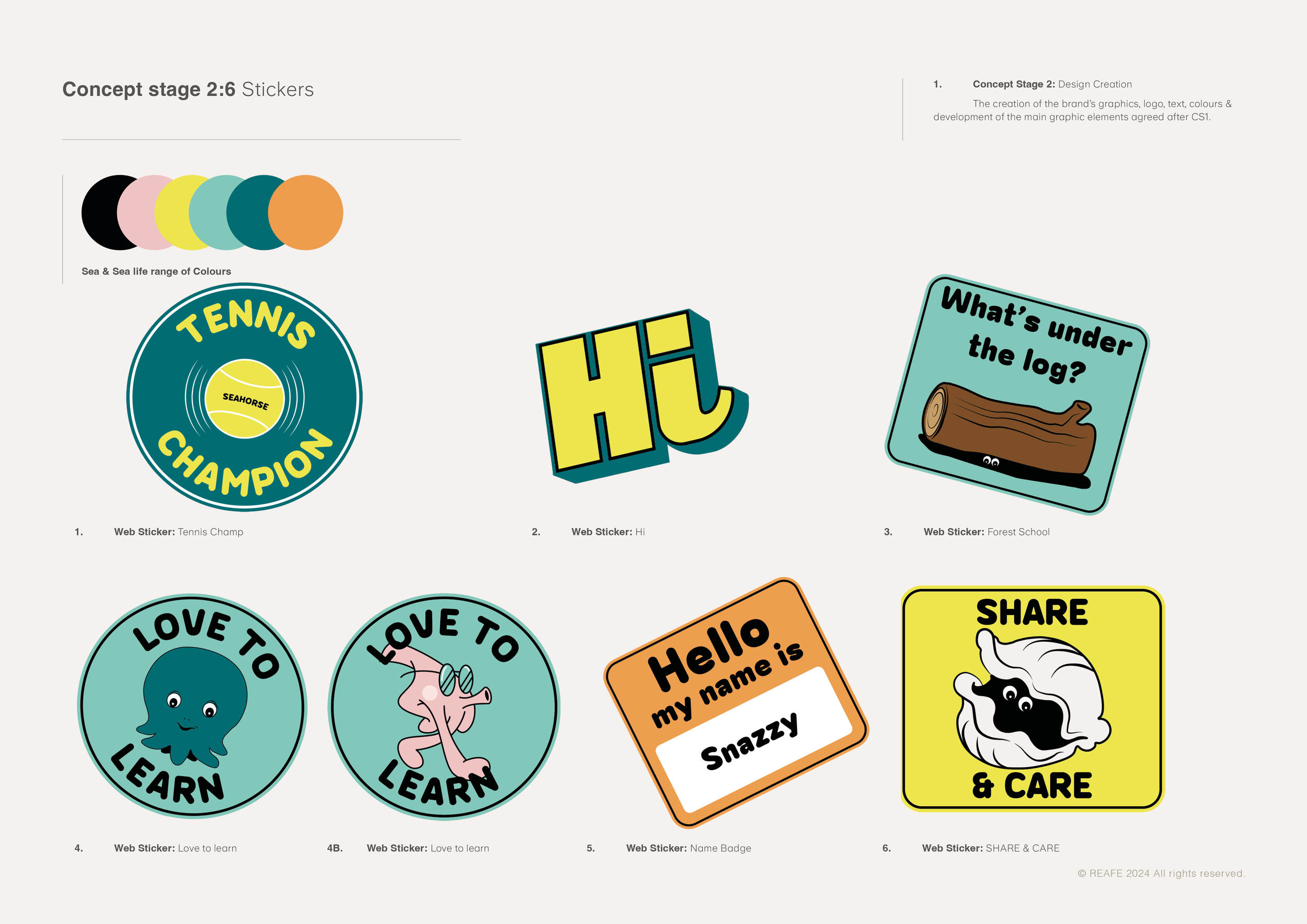
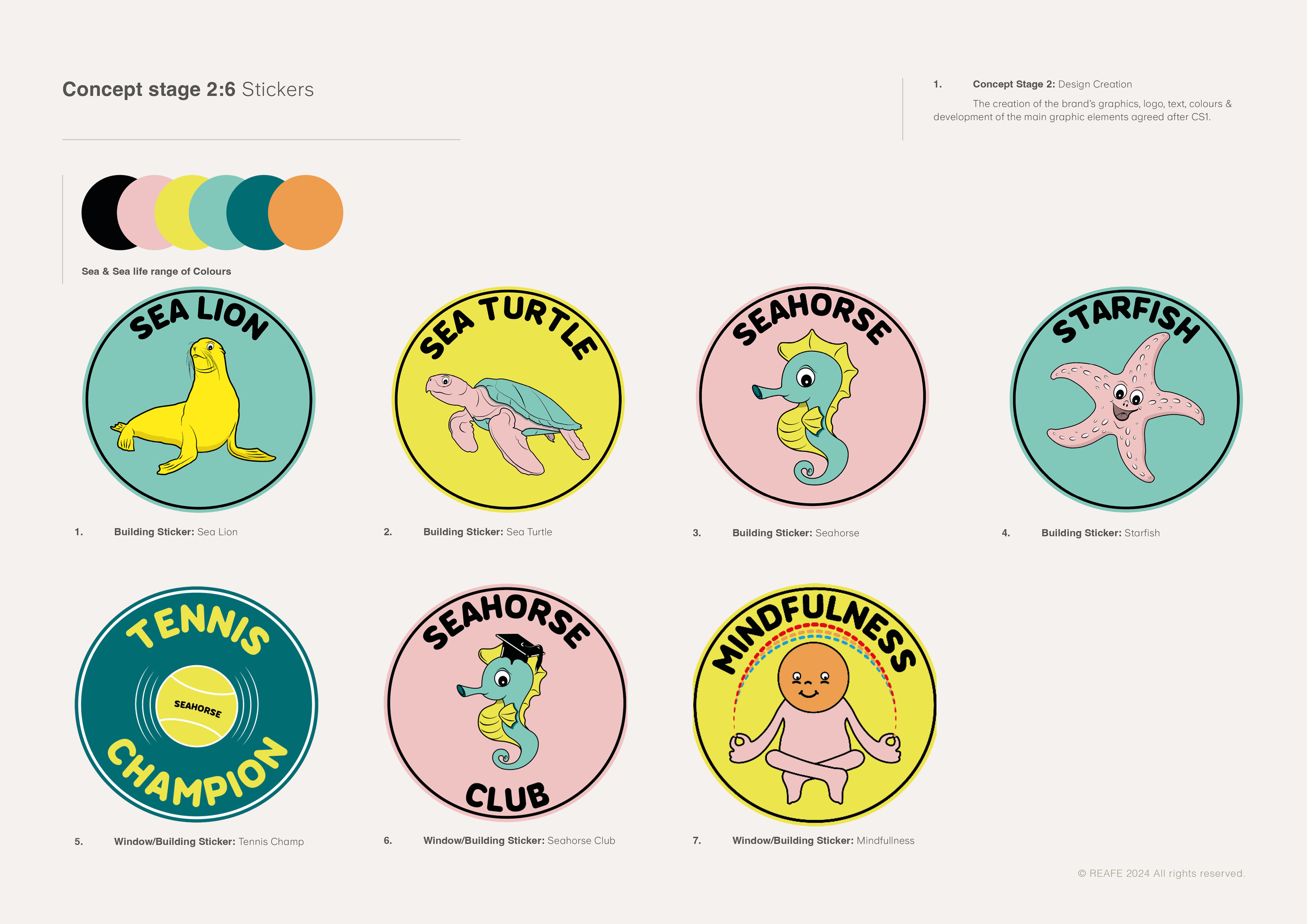
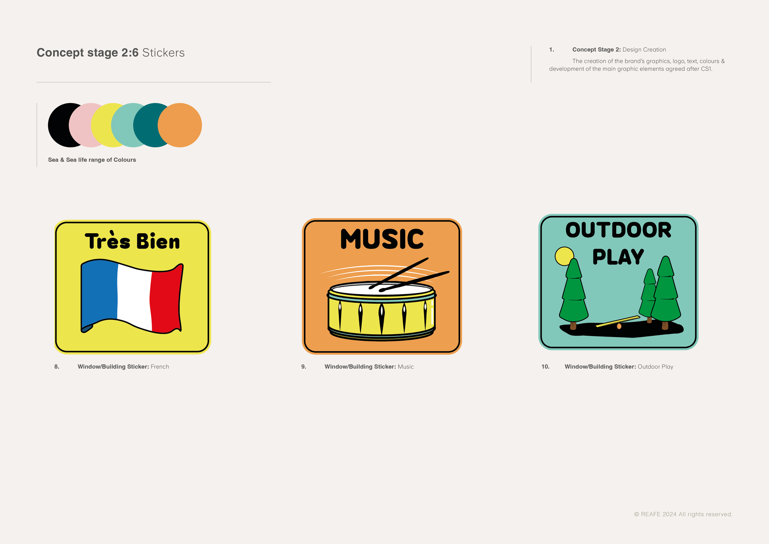
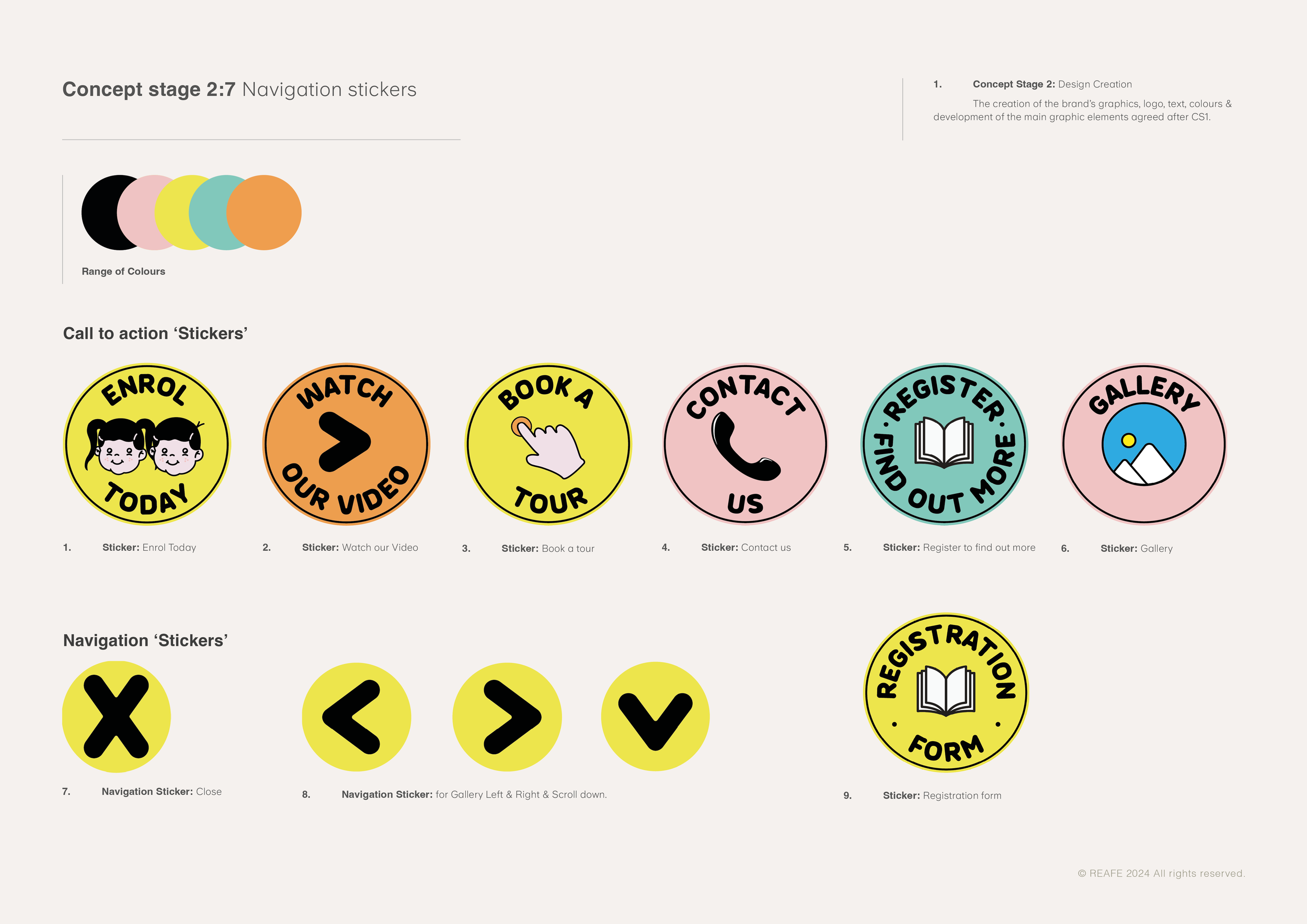
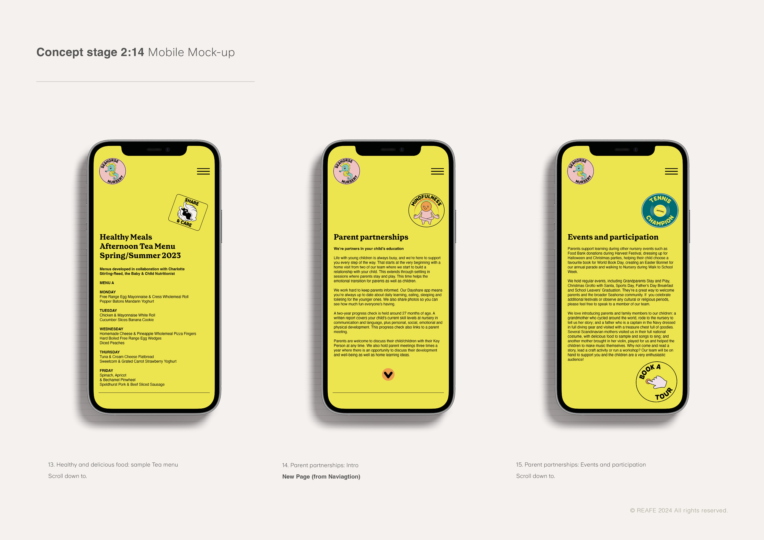
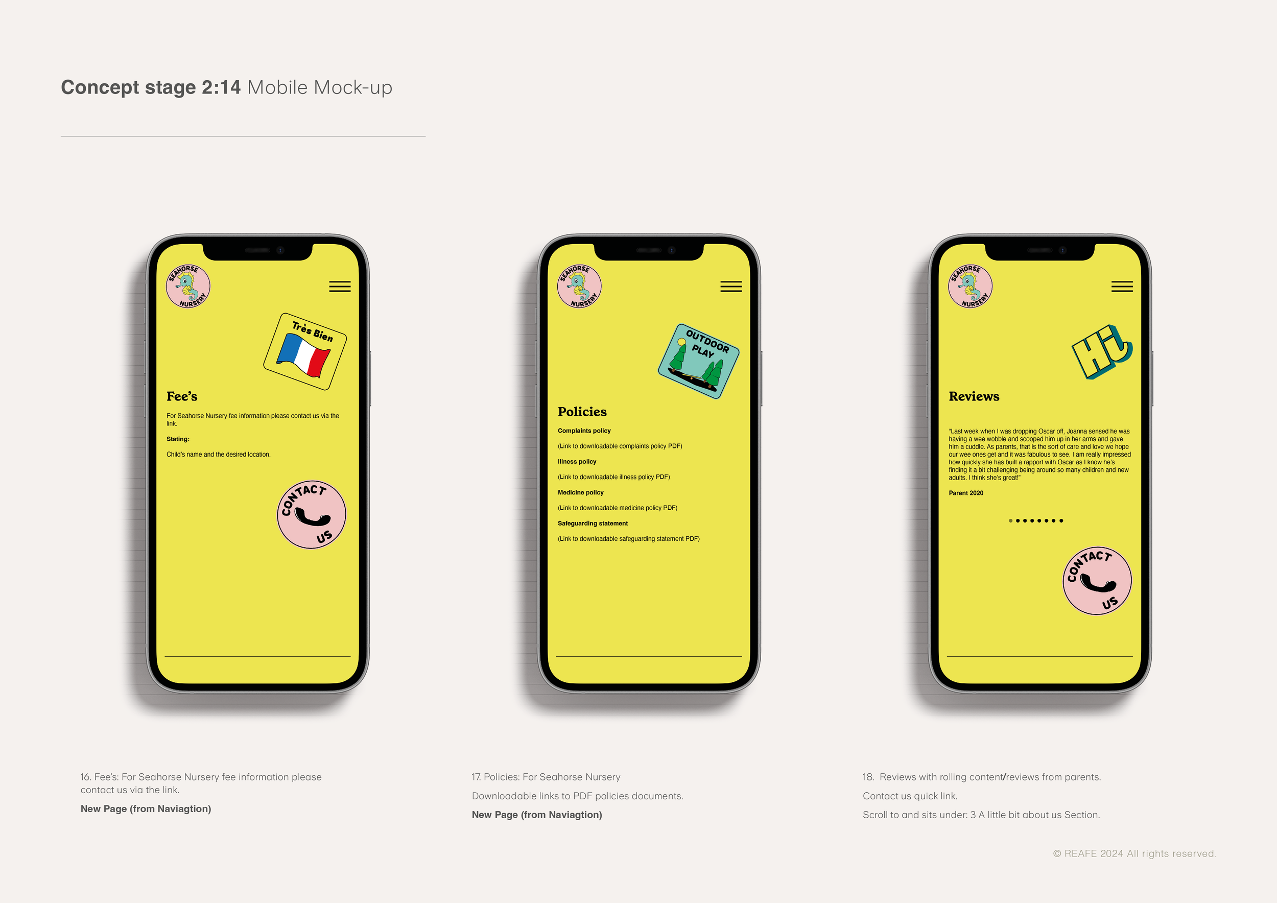
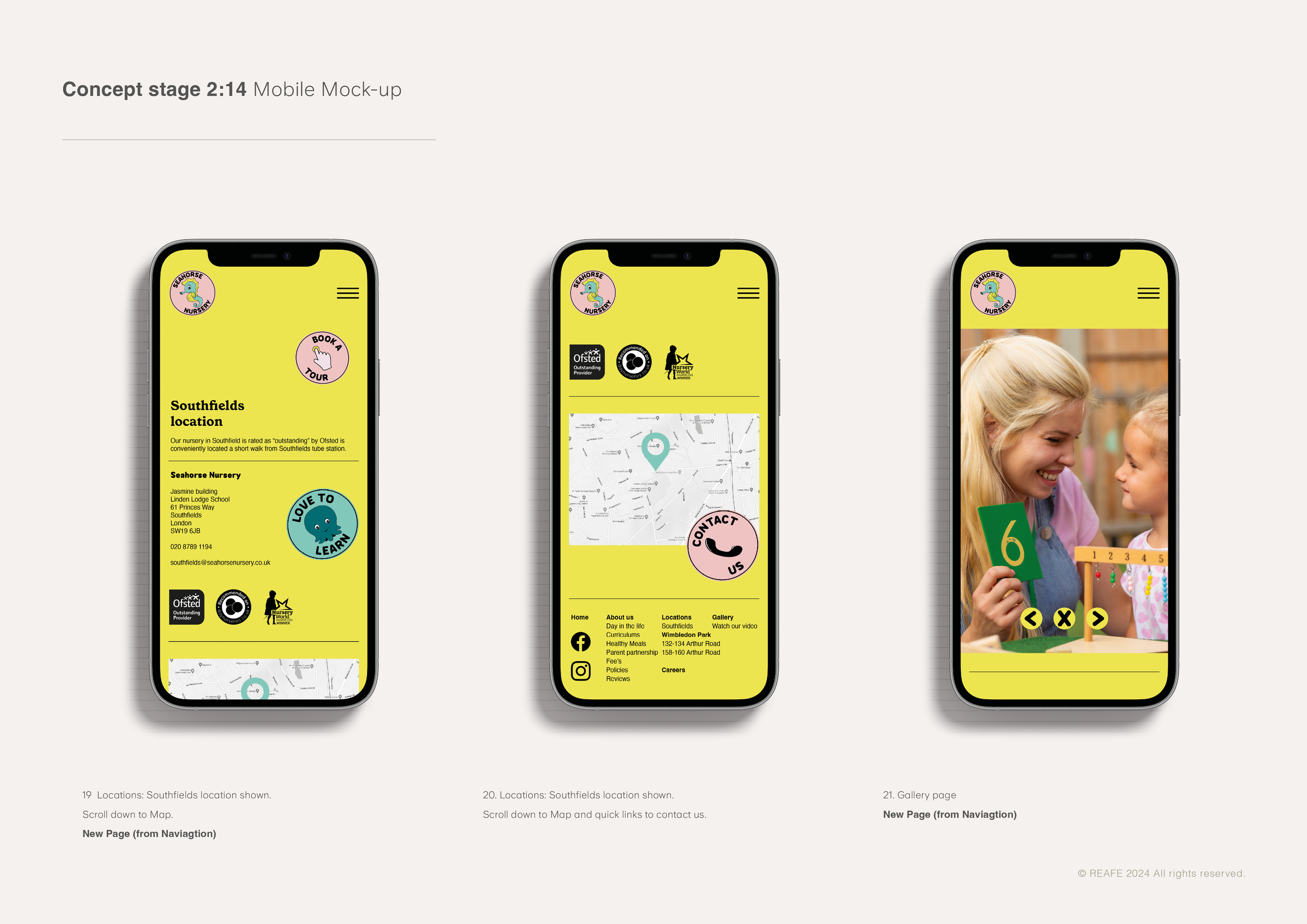
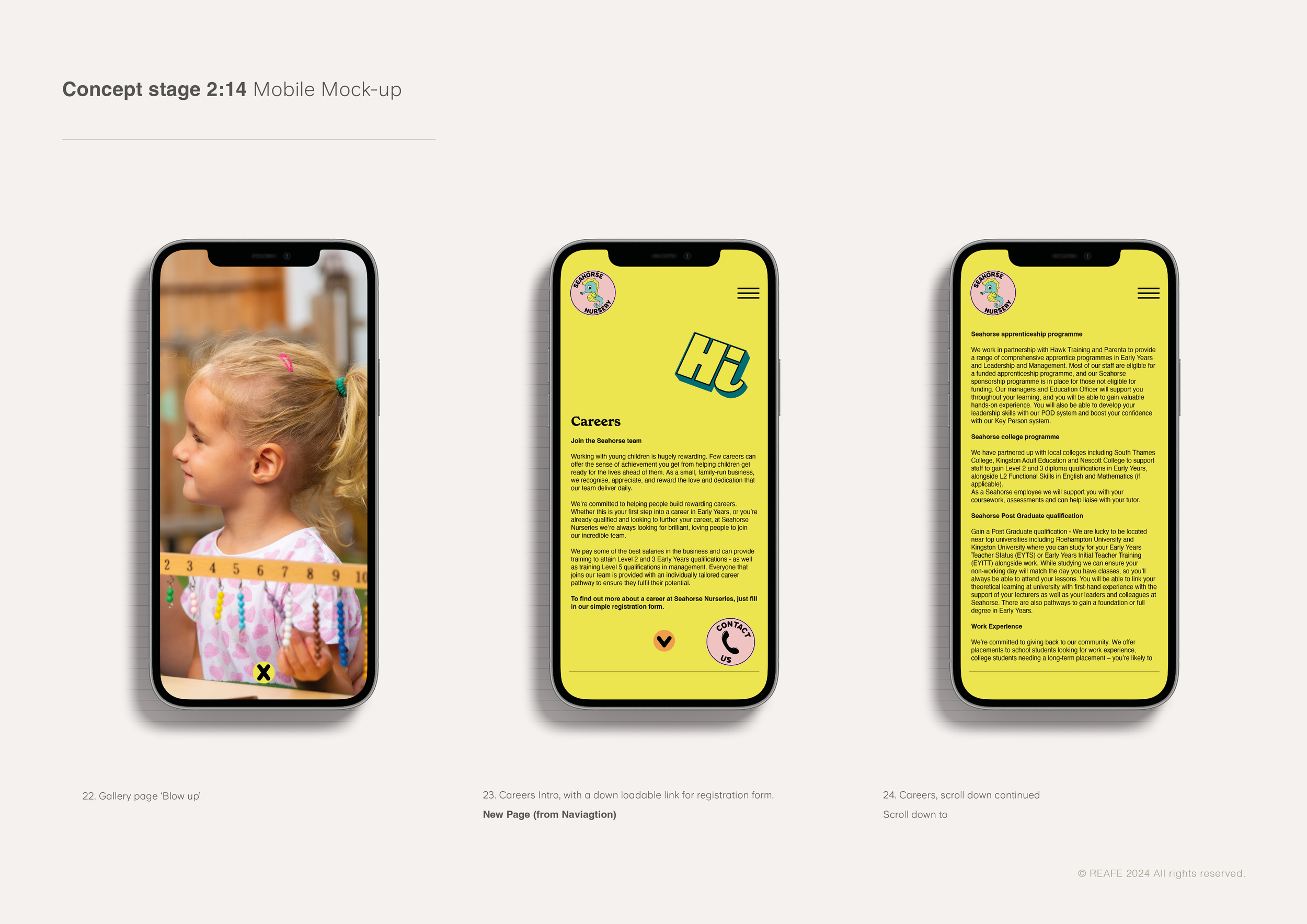
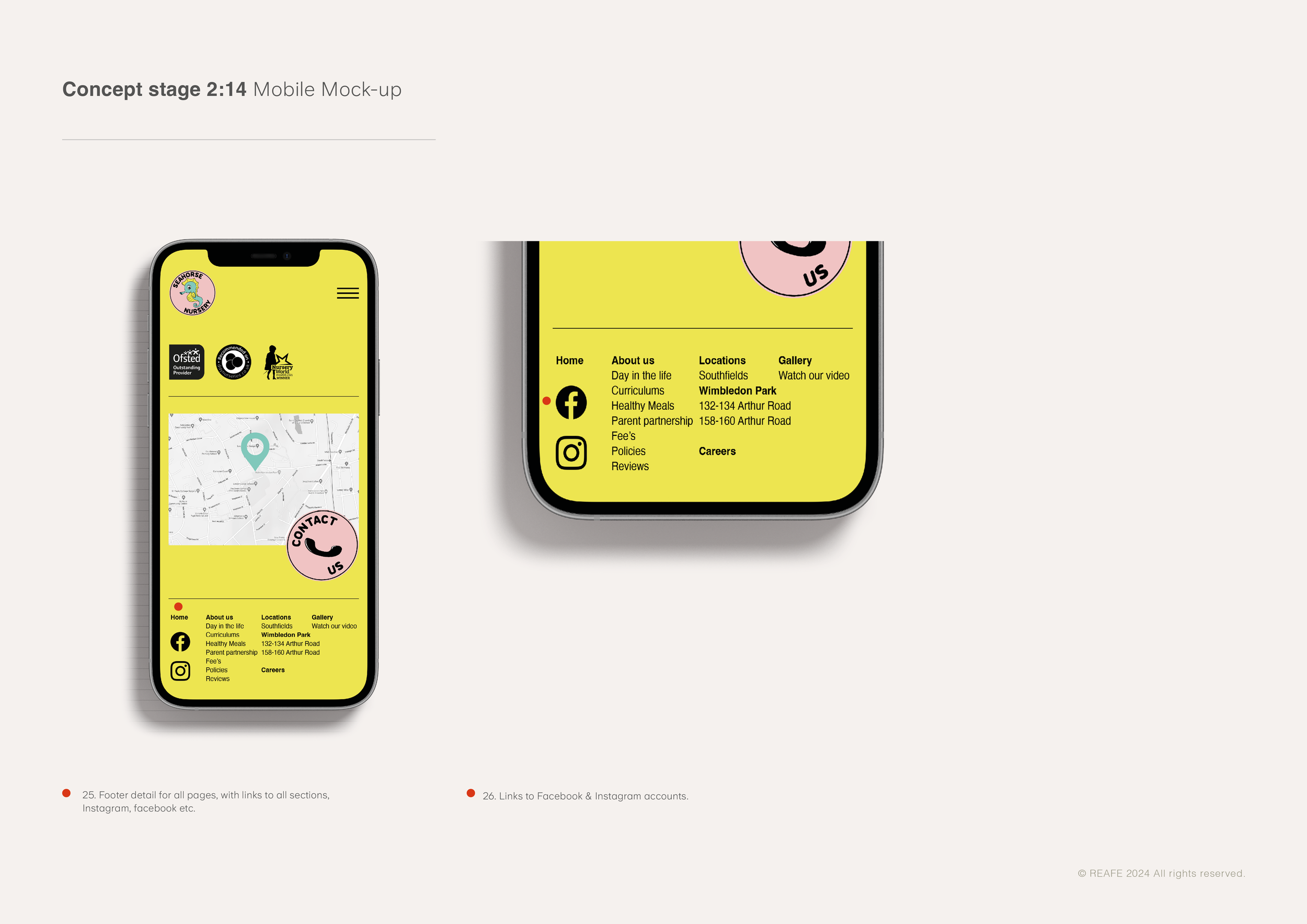
Our priority was to create a new brand that felt playful and fun and drew upon children’s love of stickers. We took influence from skateboard culture and 'sticker bombing' to ’slap’ the branding in place and used cartoon characters and Pop Art graphics. We’ve carefully mixed these different elements together to create a highly imaginative, distinctive 'mash-up' of cultures that feels fresh, bold and colourful.
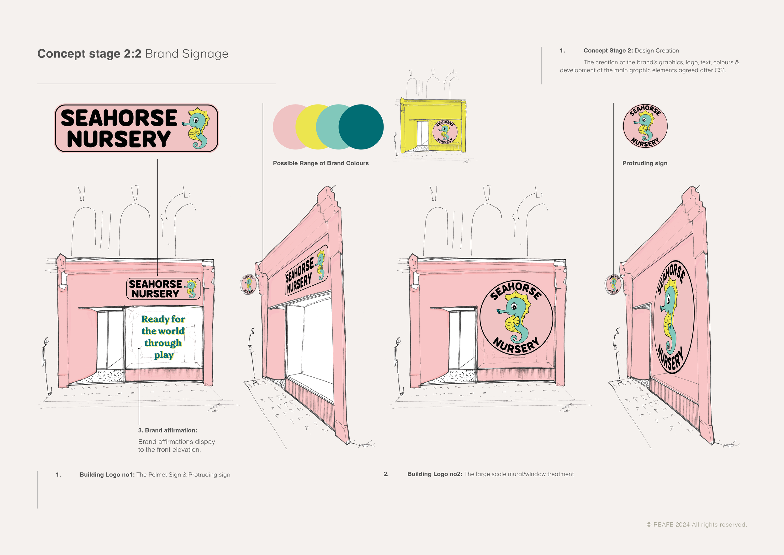
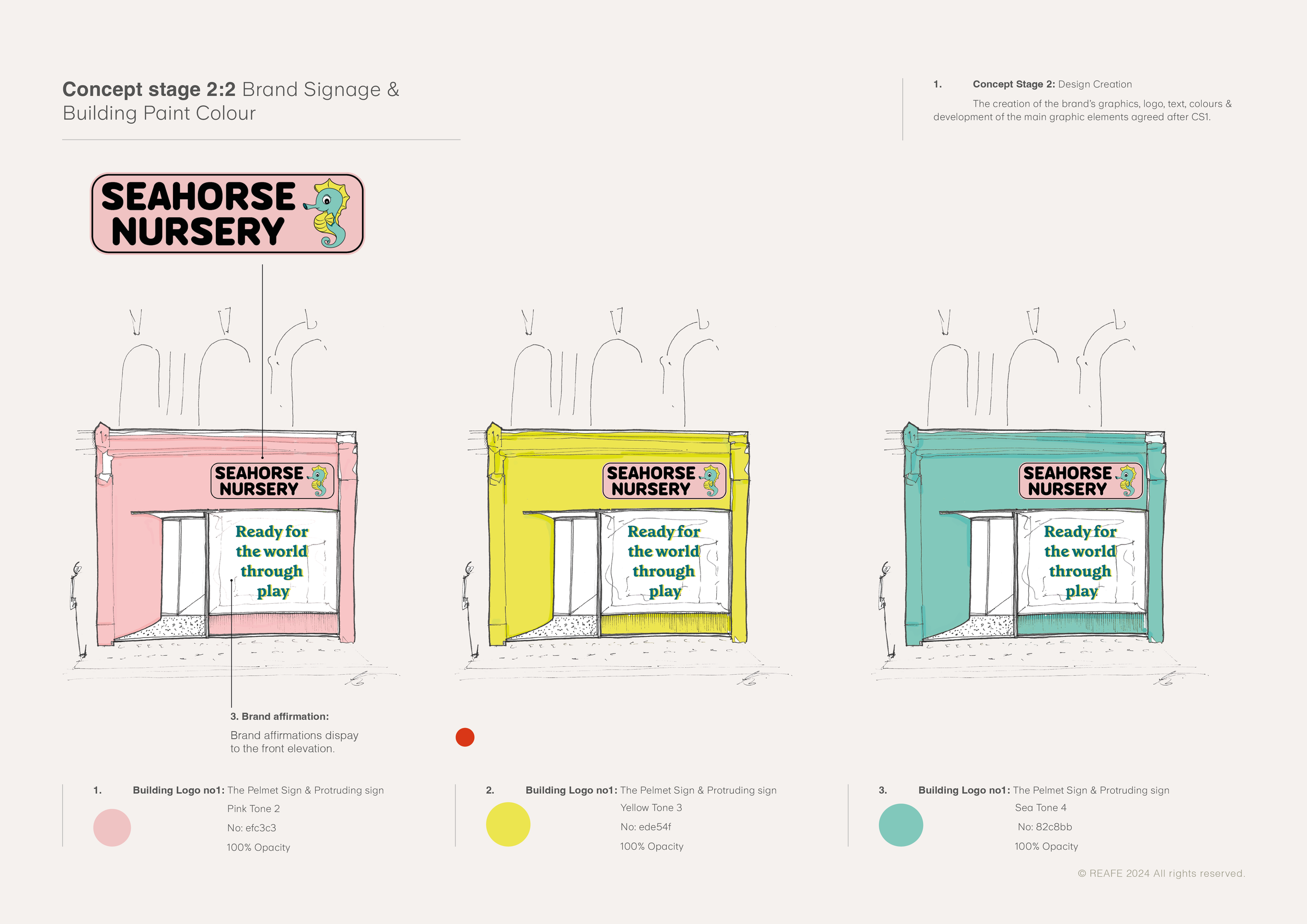
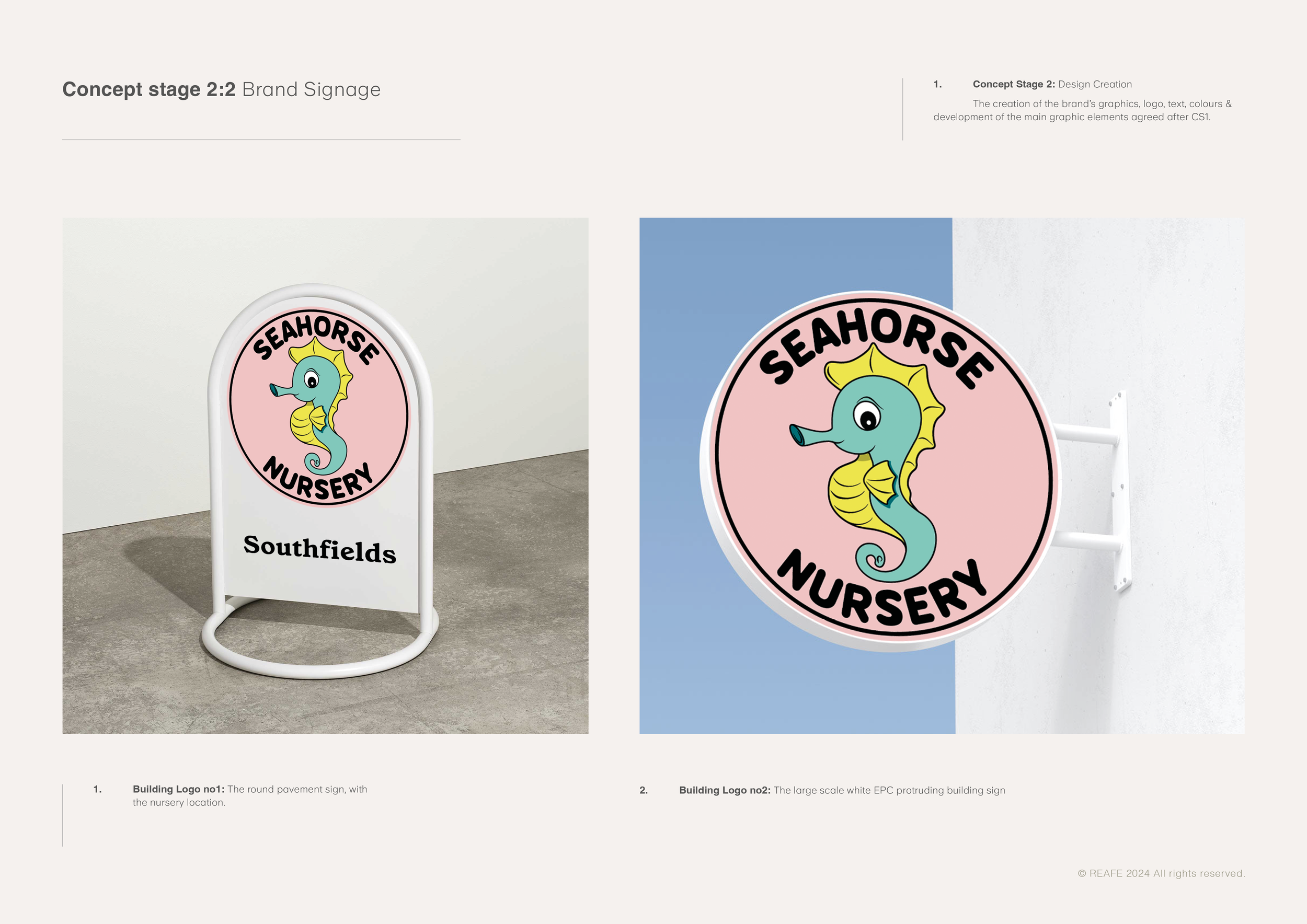
We've used this new visual language through a number of illustrations which show core activities, learning, play, characters and positive brand affirmations. This finally culminated in the redesign of the logo and branding, the website, building signage and wayfinding across the nursery estate. .